Author: admin
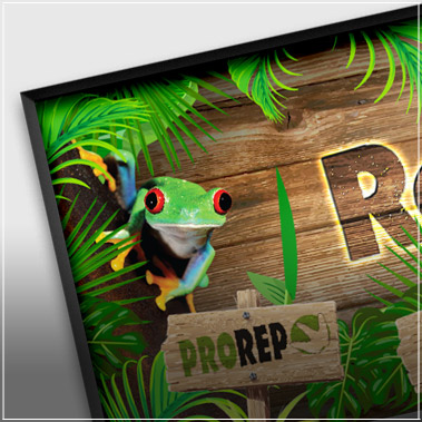
Acorn Pets Large Scale Banner
Posted onA large-scale POS banner created in In Design, Photoshop and Illustrator.
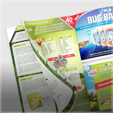
ProRep Bug Balls Magazine Advert
Posted onA refreshing half page B2C advert designed in In Design
Florence & Fred Best Dressed Male Voucher
Posted onA bright, colourful voucher designed in Photoshop as private work.
ProActive Safety Services website
Posted onThe ProActive Safety Services website needed to be subtle and sophisticated, yet easy to understand and honest. This website features a serious subject so needed to be trusted and respected to suit the market for which it was intended. This was achieved by using white as a base colour, with only subtle shades of grey […]
ProRep Website
Posted onI built the ProRep website using WordPress. It was released in early 2017 signifying a massive leap forward in every respect. It needed to show the new ProRep branding whilst also enticing users deeper into the site to find out more about our products whilst being completely responsive as being an B2C website, mobile devices […]
Peregrine Livefoods Newsletter 2016
Posted onThis latest Peregrine Livefoods newsletter completely changed in branding and identity to show the modernisation of the company through digital methods. It was altered to be much more funky, with edgy, degraded fonts and bright orange, contrasting graphics demonstrating a fun, vibrant side to the company. This style was welcomed by many customers and complemented […]
XL Nutrition Protein Bar Packaging
Posted onBoth the wrapper (foil wrapped) and outer box (card folded) packaging of this product needed to fit with the existing branding but also stand competently on it’s own. When designing this packaging, I moved the brand image forward with the introduction of a solid metal texture to the main panel giving the feeling of strength […]
ProActive Safety Services UK Ltd Logo
Posted onThis logo had many messages to convey. AS it represented a new company in a professional sector, it need to convey stability, strength, reliability and show strong tones of trust. The modern version of a triangle was used as the base starting shape, showing strength and stability. Safe, reliable colours were also used; green, blue […]


